
Subscribe
Sign in


96
Replies
Best

@_inside 100% agreed. I understand the ease of building electron apps for cross-platform, but they're not efficient at all. And, with a ton of apps going the electron route, it really starts to bog a system down. :/


@_inside Agreed here - this is the biggest pain point for me after switching from HipChat (which is super _duper_ speedy switching between rooms/channels).

@_inside Totally agree with you. Electron is a great way to provide a "native" Mac App fast, but I by myself enjoy the fully native Apps way more! Better performance and memory management. Also it just looks nicer in the macOS ecosystem.

@_inside +100 - MacGap => Electron feels like 2x-10x faster depending on the use-cases, but it still feels like a web app imo


Great article on @TheNextWeb about Slack's Beta. http://thenextweb.com/apps/2016/...
Key Section:
Their current macOS app is built using MacGap, which is a wrapper for web apps — so technically, it was just a port of the web version of the Slack website in a desktop window. However, the beta is rebuilt from the ground up using Electron, speeding things up significantly."
It mostly still looks like the same old Slack, you’ll immediately notice these key improvements:
• Insanely fast start-up and team switching
• The team bar now changes according to your color scheme
• A fancy new top without that ugly desktop frame
• The app in general is way more speedy

@nivo0o0 @thenextweb Massive improvements! my Slack app is now on steroids (and no, I didn't just spend 2 minutes switching between teams)


@nivo0o0 @thenextweb For the record, Electron is a web app wrapper just like MacGap. MacGap is just a dead project whereas Electron has a lively community and ongoing updates.


@cm0nt0y4 @nivo0o0 @thenextweb Fun bit of trivia for people as well, MacGap was originally developed by Alex MacCaw who now does Clearbit :-)

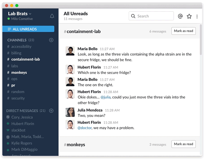

@bentossell @slackhq The "All unreads" feature is available in all builds, wether it is beta or stable.
@bentossell I also believe you're not using the new beta, still using the stable version, because the new beta has a different design. The app frame is totally different... 
@dafonso that example is actually from the Slack blog....not my Slack ;)
I am using the new Beta - aware the 'All Unread' is on them but its a pretty good feature that I wanted to shoutout!
:)


@thomas_tomhawk_burningham i feel like the share message feature is a sort of threaded reply; very primitive but does help give context
@slackhq it's definitely snappier, but I'm missing one thing: how can I remove the teams side bar? I'm only on one team, I don't need that cluttering my UI...

@thesultanofsex @slackhq did it before my post. Just adding power to numbers by posting it on PH as well...


do like a boy who like haveing sex on the bed hotty removing your cloth and having real sex it not really hot.

Is the Mac version the only beta version available right now ? When I click on "join the beta" for Windows nothing happens...


@raphc Windows beta is live. After clicking "Join the Beta" I got a desktop notification that I'd been added to the beta group. Then clicking update via my current install of Slack on Windows prompted an update to the 2.2.0 beta build.
@ianmikutel Thanks for the tip ! I didn't get the notification, but I after clicking "join the beta" I went to the menu : help > check for updates and it updated to the beta :)

I really love the old ui theme I hope we have the option to keep it as far as the colors etc...

@marcus_davenport Agreed! (Although it says on thenextweb: "The team bar now changes according to your color scheme," so maybe the dreary grey can be changed.


This is great. The Slack startup time always kind of irked me. It's blazing fast now. I also really like how the desktop window chrome has been integrated into the UI. Nice job there.
First response from our team: add a "Hide Menubar Icon" option in the preferences.

While I'm satisfied with everything, the quality of communication, better than in Skype.
Pros:Ye, very convenient!
Cons:More instructions for beginners


Is this the version with comments? Catching up with things I've missed is a pain I can't wait for comments so I can only read the threads that are important to me!


incredibly better. best addition to this version a top bar menu icon that will 1. allow to switch team 2. change colour when updates! (which was critical for me if you have the mac app bar which auto hides) https://cl.ly/1f0W2k0T0K2R


I like the "All Unreads". Feels about the same speed as the "old". Isn't Electron just a newer wrapper around the same web app? So far, I miss the draggable bar since I re-position my Slack window a lot.


Can we please get a small chat popup view? Like the Hangouts extension (which ironically Google is changing to be more slack-like next month) where a small individual channel would be a chat overlayed over my work and can be collapsed.

You make an electron project but no beta for linux users ? :( Big no for me.
It's like doing a react-native app but refusing android or ios...


@florentdestrema Linux users have had our Electron app for over a year now fam :)
Oh my gosh so sorry I just downloaded it, was using the standard web version since the beginning, now I understand the difference!

So much better than previously & a big fan of the app being rebuilt on Electron!


AirBuddy